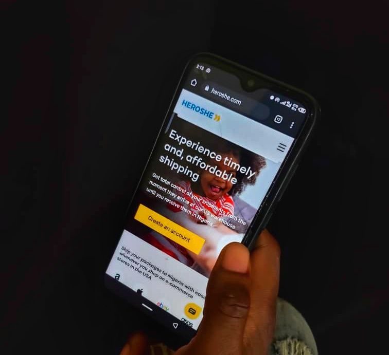
Top 5 Features We Absolutely Love About Heroshe's New Website

We don't often write about ourselves at Heroshe. We focus instead on how we can help Nigerians access quality products in the US and ship them to Nigeria. But in case you have not noticed, we underwent a change recently. While our old website served us very well while it lasted, we decided it was time to freshen things. That is how Heroshe's new website came into existence.
The new website excites us very much and we use this opportunity to share some things that will make the new website an even better experience for YOU. We really hope you feel the same way.
Key Features of Heroshe's New Website
1. It is Beautiful!
The design team had fun creating the new website, and it shows! It is gorgeous! We rebranded the Heroshe logo and ensured the new website is bright, cheerful, and human - some of the things we represent.
We love everything from teal blue and golden yellow (now Heroshe yellow) in the color palettes to the clean, modern design. We hope you love it just as much.
2. Heroshe's New Website is Optimized For Mobile Devices
The user experience on mobile devices for the old site was not great. And with over 60% of our traffic coming from mobile, improving the mobile experience was critical.
The new website has a mobile-first design that improves page-load time by over 73% and reduction in data usage by 40%. This is why the new website is mobile responsive. It detects your device and delivers the right size of content to you. Have you tried visiting the website on mobile yet? Take a look and let us know your thoughts in the comments section.
3. See How Heroshe Can Help You
Looking at the old site, you will get excused if you think only individuals can use our shipping solutions. This time around, we decided to do a better job of making the solutions we provide more prominent.
Check out the different solutions pages from dropshipping to education and business.
4. Re-engineered Package Search and Tracking
Before now, tracking your package meant you had to log in to your Heroshe dashboard. This was something a couple of customers didn't find convenient. We decided to do two things. First, we brought the tracker to the homepage so users don't necessarily have to log in before getting the necessary information. Secondly, we completely re-engineered our package search and tracking feature.
Now you receive useful information that is as close to real-time as possible.
5. More In-Depth Information About What We Do
The old website did not do an excellent job of sharing information about what Heroshe does. We wanted the new website to give better information on the solutions we provide and how they can benefit you.
We set out to build a website that brings the right information front and center. The new website delivers helpful, clear, legible, and contextual information before you even think of looking for it. Check out resources like the Solutions pages, the Help Center, and the Blog.
We want to thank everyone on the team for their work. We’re thrilled with the result!
What do you think of the website? Let us know in the comments. We would love to get your feedback and see if there are ways we can continue to improve.

